

About
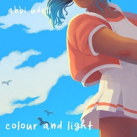
Improve the colour and lighting in your illustrations with these tips
Up until I went to college, I had absolutely no sense of colour. This usually surprises people, as colour is now one of my strengths. In this tutorial, I wanted to share a few tips that helped me out a lot when it came to colour, and some advice for lighting/shading. I worked in Photoshop for all of the examples shown, but a lot of the basic ideas work in digital and traditional media.
-
 Crafterella featured Colour And Light
29 Jun 23:00
Crafterella featured Colour And Light
29 Jun 23:00
-
 Joshua B. favorited Colour And Light
17 Jun 11:24
Joshua B. favorited Colour And Light
17 Jun 11:24
-
 Abbi Laura published her project Colour And Light
16 Jun 09:00
Abbi Laura published her project Colour And Light
16 Jun 09:00
You Will Need
-
 Step 1
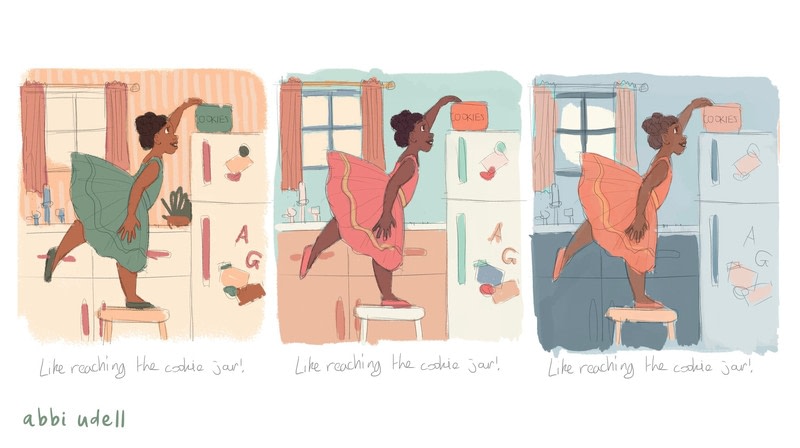
Colour studies are the most important part of my process. Al you have to do is take your basic sketch and quickly paint in some variations on colour. Colour studies can show just a slight shift in colour temperature (like the top two examples) or even completely change the mood and setting of your piece. Doing more colour prep work saves a lot of time later on as you won't have to totally repaint/recolour at a later stage!
-
 Step 2
Tip: Find some successful illustrations that have a similar mood or subject matter. Take a look at the colours used and try to figure out why they work so well. Are they mainly saturated, neutrals, or a balance? Is the palette complementary, analogous, triadic? Is there one single colour that pops, and why do you think it was used in that way?
-
 Step 3
This step saves a ridiculous amount of time later on if you struggle with lighting/shading. There is nothing worse than getting half way through a traditional or digital painting with lots of detail before realising that your light source just isn't working and your shadows look wrong.
-
 Step 4
Before you start working on your final piece, do a few lighting studies. Play around with the direction of the light. You can do this traditionally, or by using multiply layers on any drawing application. You can even play around with the colour of the light. Remember that a warm light will create cool shadows, and vice versa.
-
 Step 5
Sometimes it can be helpful to create value studies. These take into account the value (ie lightness/darkness) of the different areas in your. Areas with greater value contrast will draw the eye much more than areas where the values are very similar. You can also create more atmosphere by letting the values of objects in the distance blend together - this will push them further into the background.
-
 Step 6
My process for this illustration involved a traditional value study with pens in shades of grey. I then did two digital colour studies, which both evoked different moods.
Remember that you make the rules! You don't have to paint green trees and blue skies. Your sky can be turquoise and your trees can be bright pink, and the piece will still feel natural so long as the colour palette is cohesive!
-
 Step 7
In this example, I painted one rough colour study with what I thought of as the base colours. I then used various adjustments in Photoshop to change the colour temperature and other factors, creating different moods and different lighting.
-
 Step 8
And it's not just illustrations and paintings that benefit from colour studies! I'm a pattern designer, and I do quick colour studies for all of my patterns before settling on one palette or a set that work well together.


 1
Watercolor Art »
Watercolor Paints Made From Make Up
1
Watercolor Art »
Watercolor Paints Made From Make Up

